Looking for Agriculture Logos? You’re in the right place. Whether you’re looking to create an ag company logo or just looking for inspiration we’ve created an in depth guide that covers some of the most creative agriculture logos this year.
As a note, we’re going to come back to update this post on a monthly basis, so if you’re
Our Top 3 Agriculture Logos Ideas
Throughout this guide, we’re going to jump from some of the biggest ag companies to some of the smaller ones. This guide is meant to jumpstart the inspiration for creating your companies logo, so use it as such!
If you think we’re missing something here, feel free to point it out in an email. Or, if you don’t see your company listed, feel free to shoot us a note!
1- American Farm Bureau
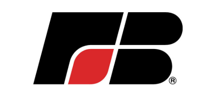
An iconic, timeless logo. The AFB logo incorporates both the F / B as well as a direct farming “thing” with the lines in the logo, just like a combine harvesting grain.
Here’s what we like: it’s timeless and modern. AFB can use this logo for the next 30 years without updating it.
What we don’t like: only companies / organizations that are massive, like AFB, can get away with this. They dump thousands into brand recognition just pull logos like this off.
Some of the Biggest Agriculture Companies Logos
1- Agrimec

Agrimec’s logo is built for the 2020’s. It follows design trends that exploded during the mid 2010’s era and should have no problem standing the test of time.
What we like: it’s modern, clean, fresh. There really isn’t a ton of extra bells and whistles.
What we dislike: for a brand that isn’t super well known, it doesn’t do the best job of telling a story instantly. If you’re an ag company, or any company for that matter, trying to design a logo like this there’s a chance you’ll have to spend significant marketing dollars on brand recognition.
Smaller Agriculture Companies
1- Crop Fertility Services

Crop Fertility Services is a company that sells pelleted chicken manure throughout the upper midwest. They went with a logo that’s a direct representation of what their product does. It makes corn grow better, so they used that directly in the logo.
What we like: the logo tells their brands story in a second. They use farm related colors and it feels like a brand you can trust, instantly.
What we don’t like: there are a few things that are outdated with this logo, for example the drop shadow on the logo and the font.
2- Live, Grow & Harvest

Live Grow & Harvest is a niche mom and pop style retail store that sells farm related products. Their logo covers the name and what they do, all in one.
What we like: simple and to the point. Not a ton of extra bells and whistles.
What we do not like: it’s very, very basic and doesn’t have a direct icon type.
![]()